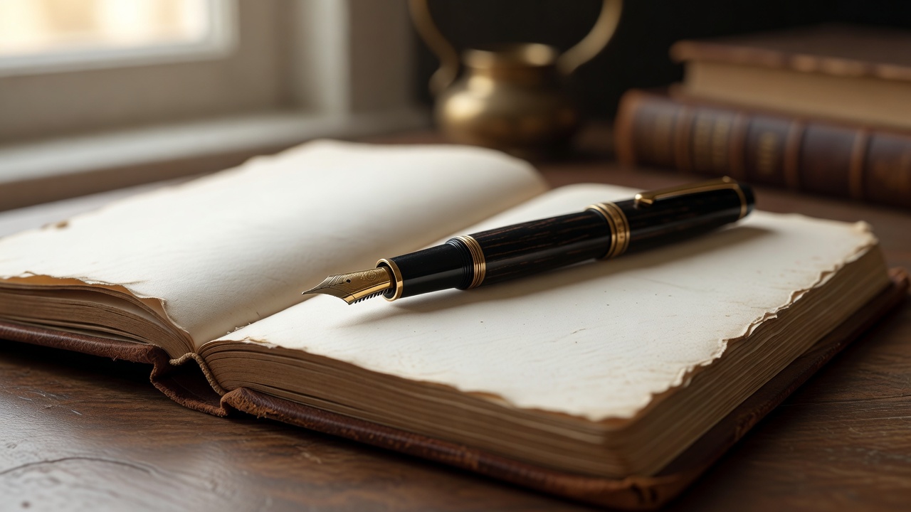
When you press a steel or gold nib onto a sheet of cotton-blend paper, the physical friction created is fundamentally different from rolling a plastic ballpoint across slick receipt tape. Fountain pens force a gentle slowing down of human speed. Liquid ink travels through capillary channels, meeting human thought at the exact point where hand pressure shapes letters.
Understanding Nib Widths & Flex Dynamics
Choosing the correct nib geometry changes your relationship with the page:
- Extra Fine (EF / 0.3mm): Ideal for small handwriting, compact grid journals, and quick margins. Provides subtle toothy feedback.
- Medium (M / 0.7mm): The universal standard. Produces rich ink shading and smooth gliding without heavy bleed-through risk.
- Italic / Stub (1.1mm): Delivers crisp line variation—thick downstrokes and hair-thin horizontal lines—giving natural calligraphy character.
Matching Inks with Cotton & Wood Pulp Paper
Not all paper responds well to liquid fountain pen ink. High-density papers like Tomoe River (52gsm) or Midori MD (80gsm) use special surface sizing to prevent feathering and show-through. Pigment-based iron gall inks provide permanent waterproofing for archival journal keepers, whereas dye-based shader inks offer mesmerizing color variation as they dry.
Practical Daily Journaling Ritual
To cultivate a lasting writing practice, set aside 15 minutes each morning before checking email. uncapping your pen, wiping excess ink from the grip section, and feeling the weight of metallic brass or resin grounds your mind in physical reality before entering digital spaces.